Interface
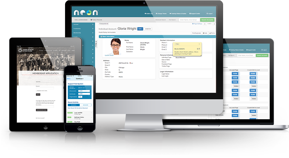
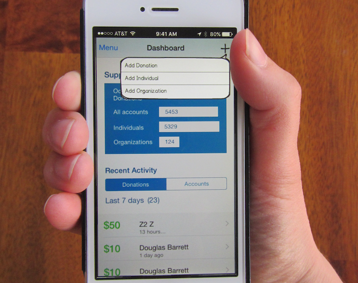
Responsive web forms for desktop
- New Profiles
- Donation Entry
- Create and Renew Memberships
- Order Summary & Payment
Methods
- HTML Prototypes
- Pattern Design
- Use Cases and Workflows
- Wireframes
- User Experience Tests
- Card Sorts
- User Interviews
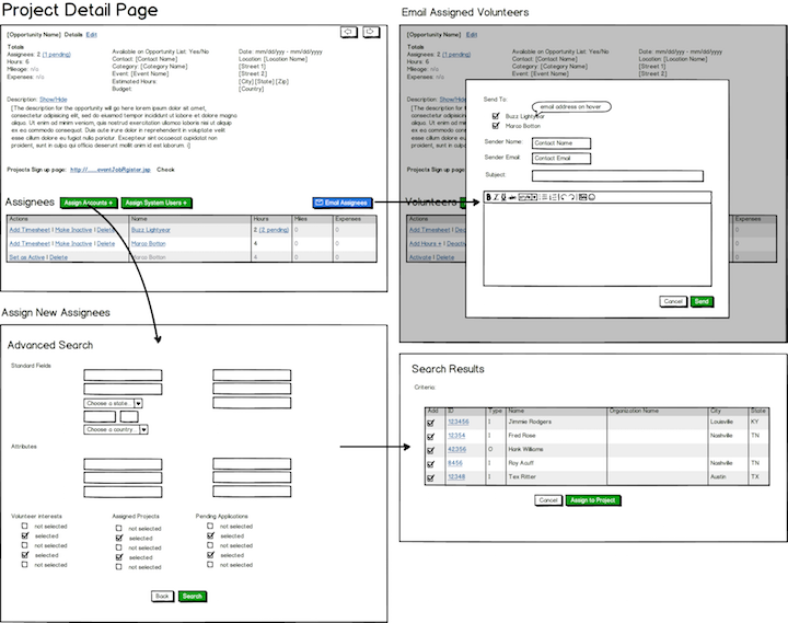
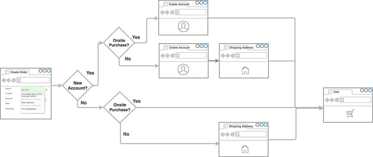
Task Flows
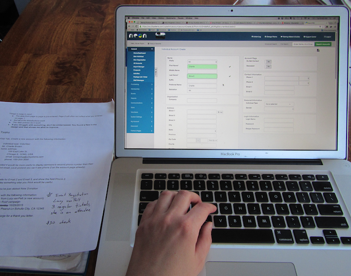
I interviewed users and learned that they had difficulty locating the fields they needed to quickly enter information. They would overlook which fields were required and typically forget to check whether they were creating duplicate accounts. I diagrammed the current workflow and saw that it had very little feedback for our users during the data-entry process. I designed new workflows to include real-time validation of required fields, and type-ahead checks for duplication.
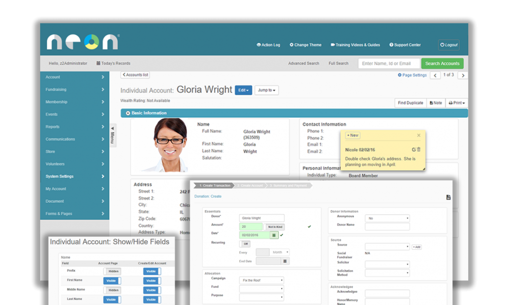
Pattern Design and Wireframing
For nonprofits that did not need to collect every available field, I designed the entry points and the mechanics to customize forms to include only information each group needed and reduce “noise” of rarely used data. I grouped the remaining fields into skimmable categories based on a card sort. For consistency of user experience, I designed parallel form, settings, and summary pages to share a common layout, always displaying editable data in panels with the same field order to increase familiarity.
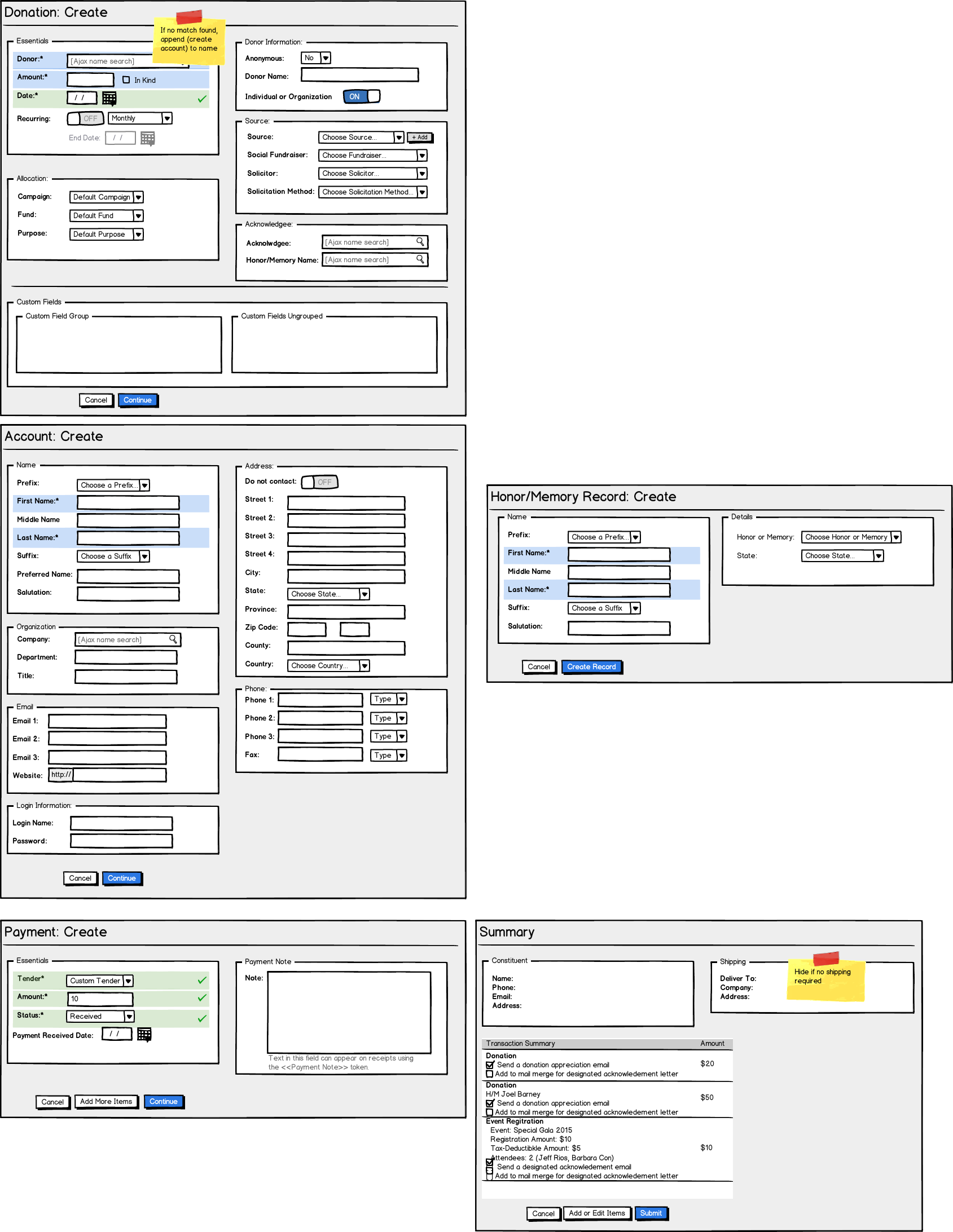
HTML Mockups and Testing
To test these designs, I created HTML prototypes within the Bootstrap framework, which I iterated for user experience tests on a variety of new and experienced internal employees. These tests pages proved easy to navigate for both new and expert users. The tests exposed some flaws with field order, which influenced the rearrangement of categories within the page to make data entry feel more natural.
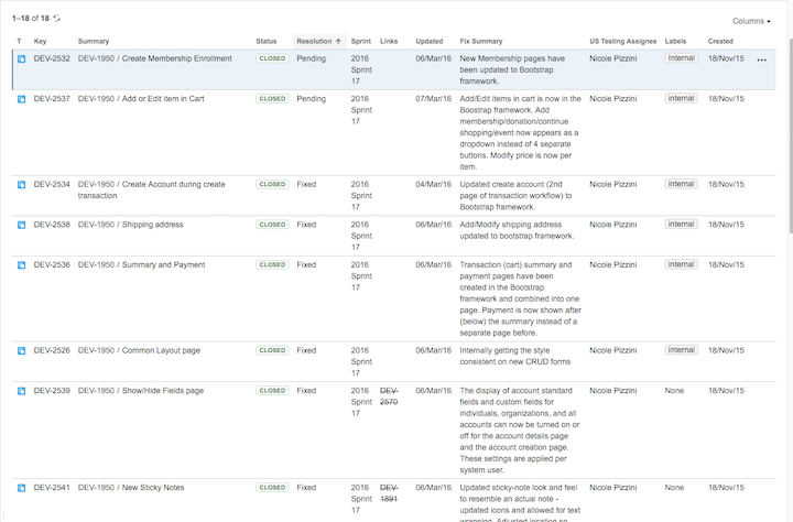
Implementation and Q & A
I sent the HTML of my final mockups to our developers for implementation. I was the point person during the build and used Jira to communicate with our remote developers through all questions and concerns that arose. I also coordinated quality assurance tests around each use case to make sure it worked as expected.